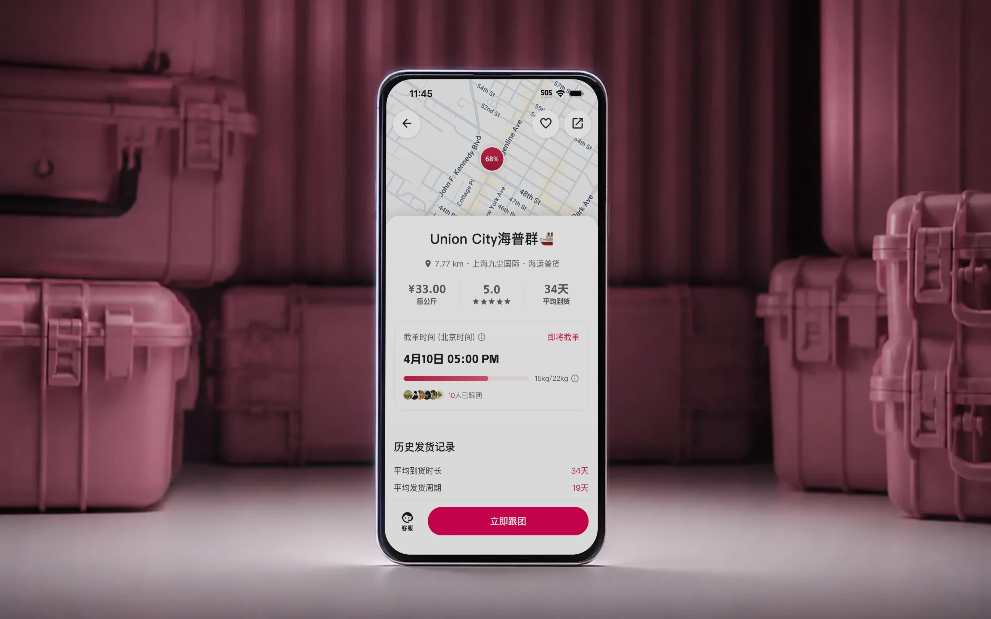
Case study · Pindo
Two clocks, one box
Pindo pools sea freight for people buying from China. Everyone's parcels ship in one container, split by weight, so a box costs a fraction of sending it alone. I cofounded it and own product and design.
Shipping one parcel home from China can cost more than what's inside it. Freight forwarders solved that decades ago. Pool everyone's parcels into one container, split the cost by weight. Nobody solved how you get into a pool. You search until you turn up someone's WeChat group, join it, and take the organizer's word for everything after. Your order is one message in a thread.
Pindo is that pool as an app: find one, join, pay, track, collect. Four of us: a CEO, marketing, and two on the build. My cofounder owns the backend; everything a user touches is mine.
We run an AI-assisted build loop — a tokenised design system and a written spec the agent codes against — so a screen goes from idea to device in an afternoon. Speed doesn't decide which screen is worth building. That part is still mine.
A pool runs on two clocks.
One clock is the pool filling toward its shipping weight. You don't control it; it moves when strangers join. The other is your order: paid, packed, on the water, in hand. Most of the anxiety of waiting is watching one clock with no idea what the other is doing.
Both clocks are also what people shop on. Asked what decides which pool they join, 83% named the ship date and 54% named how full the pool already was (n=35 · preliminary survey). Both have to be legible before someone commits, not only after. The two decisions that follow take one clock each. The third is how four people ship either of them at all.
Weight estimate
拼团中The bar that moves before the box
Every pool shows a progress bar: how full it is, how close to shipping. The weight behind it was honest. Scale weight, measured at the warehouse. That is what made it late. A pool could take a dozen new members and the bar would not move until their boxes turned up.
Two to seven days of that gap is transit. The rest is intake, the merchant entering each parcel by hand, which often runs longer than the shipping did. Anyone deciding whether to join is looking at the emptiest version of the pool there is.
So the app asks you. Joining a pool now raises a bottom sheet that asks what your shipment will weigh.
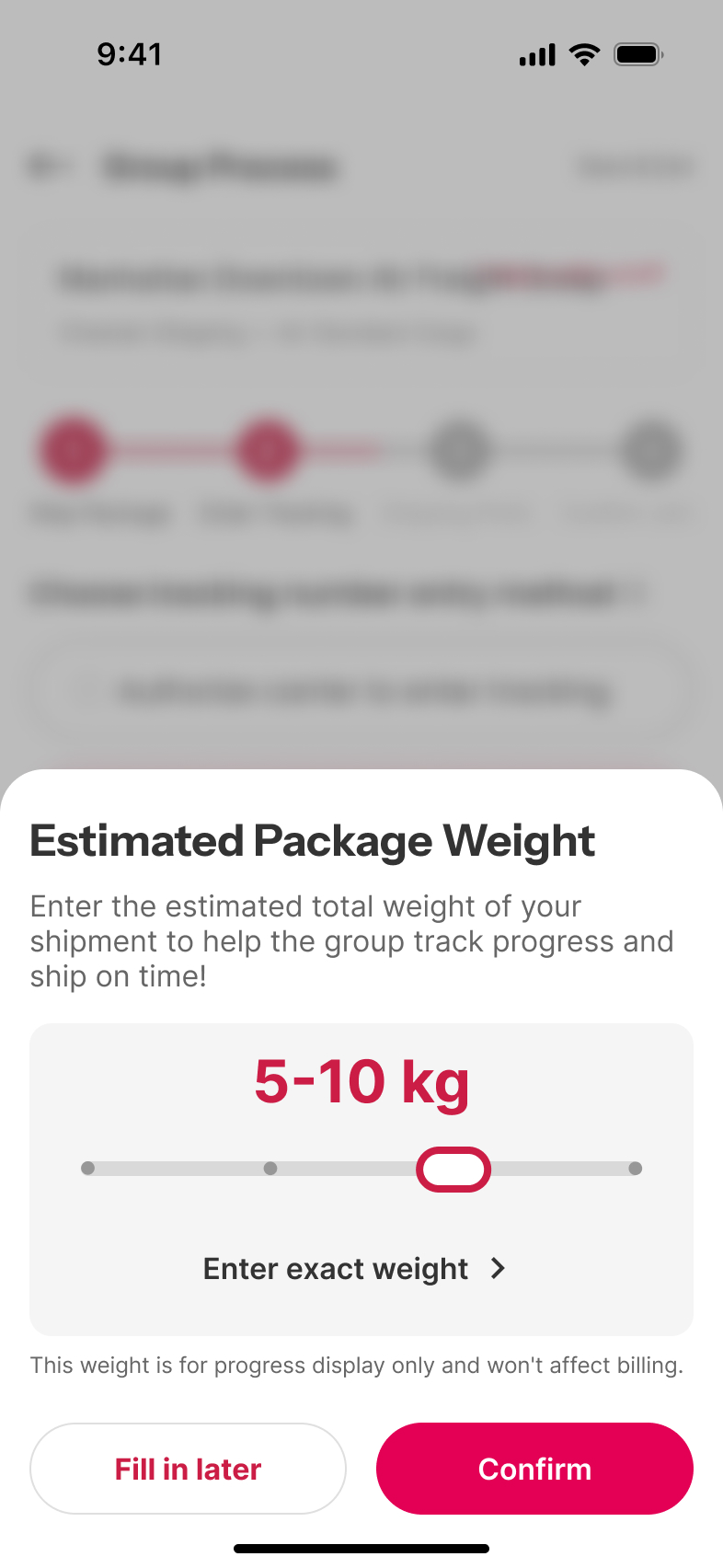
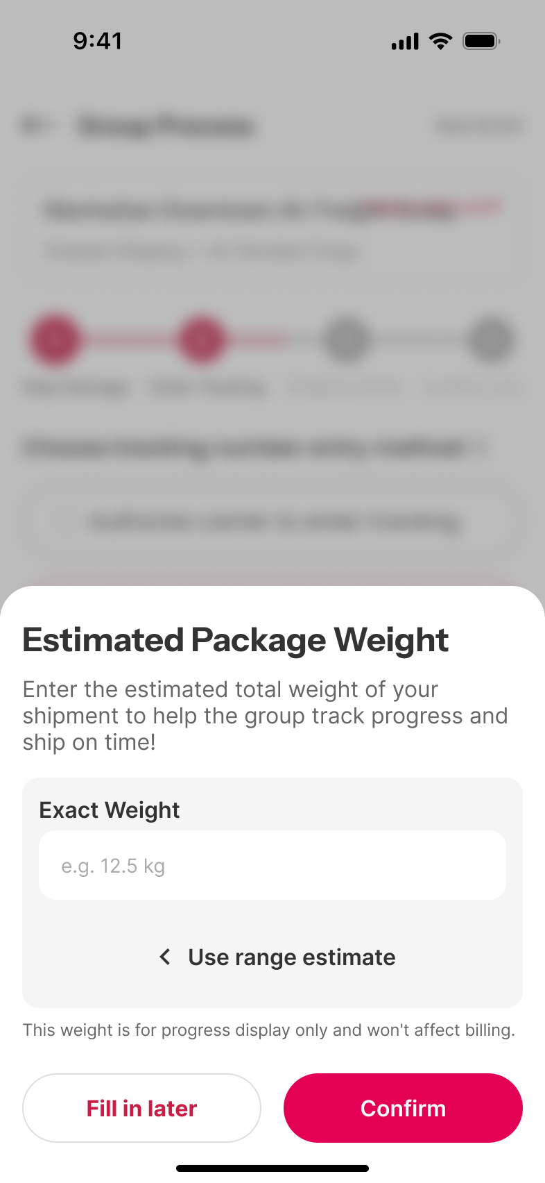
Almost nobody knows what their shipment weighs. Two pairs of shoes
and a jacket is not a number people carry, and an empty numeric
field is where a join flow drops people. So the default is a
range, not a number — a band slider reading 5-10 kg
.
A guess between two numbers is answerable in a second. The exact
field sits one tap behind it, for whoever has the parcel in hand.
Two lines around the input do more work than the input
does. Fill in later
is the escape hatch. The sheet
never stands between someone and the pool they came to join. And
This weight is for progress display only and won't affect
billing
decides whether anyone answers at all. If a guess might change what you pay, the safe move is to skip it.
The estimate stays editable on the pool screen, so a rough guess gets corrected the moment the order ships.
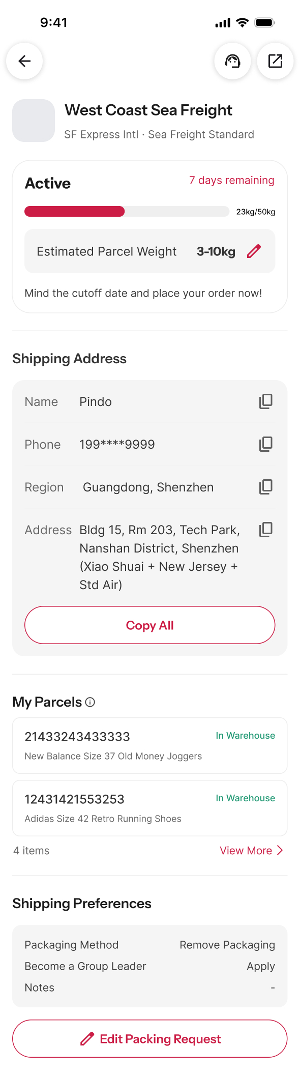
The estimate turns the bar from a lagging indicator into a leading one. Pool weight becomes readable while the parcels are still in transit, the same window where people are choosing a pool and the organizer is setting the cutoff. The pool card carries that forward number, so a pool reading half full is half full now, not as of the last delivery.
Estimates stay rough by design. Every box is still weighed at the warehouse, and scale weight overwrites the guess as it lands. What the estimate covers is only the stretch before that. Its second half, a box sitting in the intake queue, is the next chapter.
Smart intake
入库The parcel that names itself
Dozens of boxes land for a single pool, and someone has to know whose each one is. Intake was manual: read every label, match a handwritten nickname against a list. Slow, and one mistyped name stranded a box.
There is a standard answer, and its price is why nobody we spoke to used it. A warehouse management system means a barcode scanner and the terminal to run it, upwards of ¥10,000 before a single box is scanned. That is why a small forwarder is still working from a handwritten list. So the constraint arrived before the design did. Whatever we built had to run on a phone the merchant already owns.
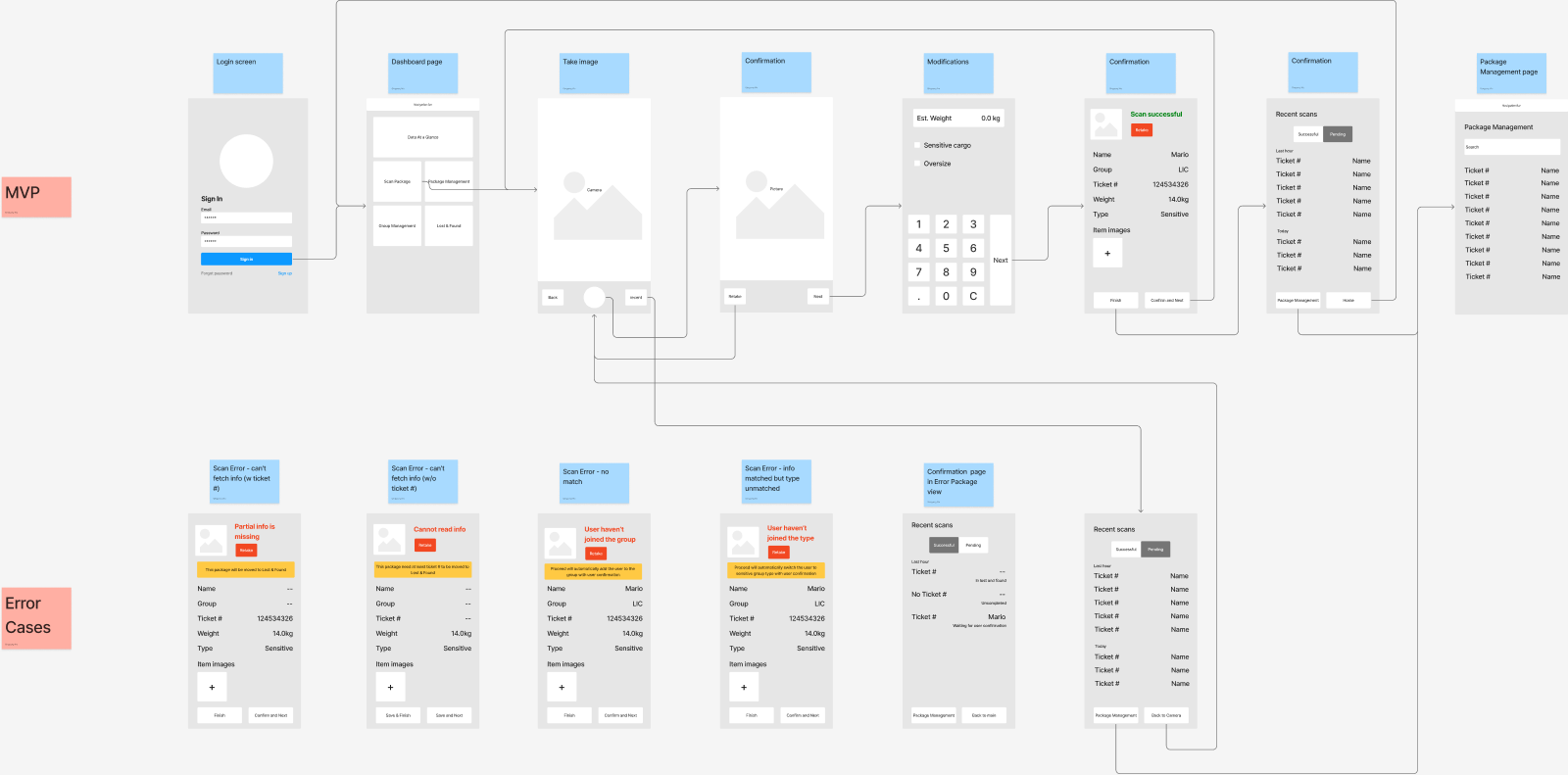
Designing the error cases first set the shape of everything after.
The POC sent an unreadable box to Lost & Found
. A shelf,
and a shelf is where a parcel becomes somebody's afternoon. What
shipped starts earlier than the warehouse. It starts at checkout. Join a smart-intake pool and Pindo issues an address with a short code inside it. The store prints it on the label, and the box
arrives carrying its own answer.
广东省广州市 · 潮富路 海运JP1ABCD 118号二楼 A201
which way it travels
which shipment it joins
anonymous, but yours
From there the loop runs on hardware nobody bought. The camera identifies; a person does the one part a camera can't, which is the scale. Step through it.
-

Buyer
01. Copy the address
Paste the address Pindo gives you at checkout, exactly as it is. The code inside it is what the warehouse will read back.
-
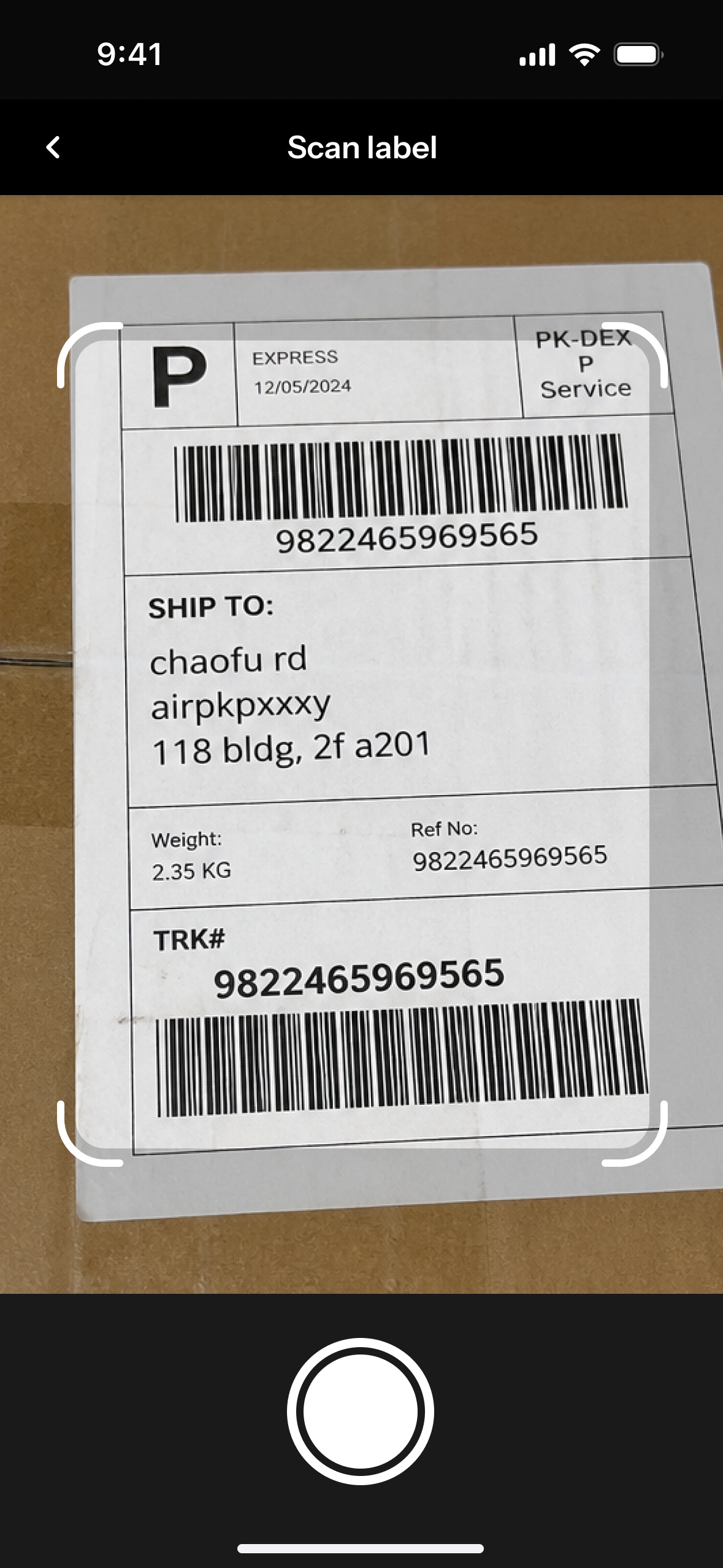
Warehouse
02. Photograph the label
No scanner, no terminal. The warehouse tool is a web page, opened on the phone the merchant already owns. One photo of the label is the entire input.
-
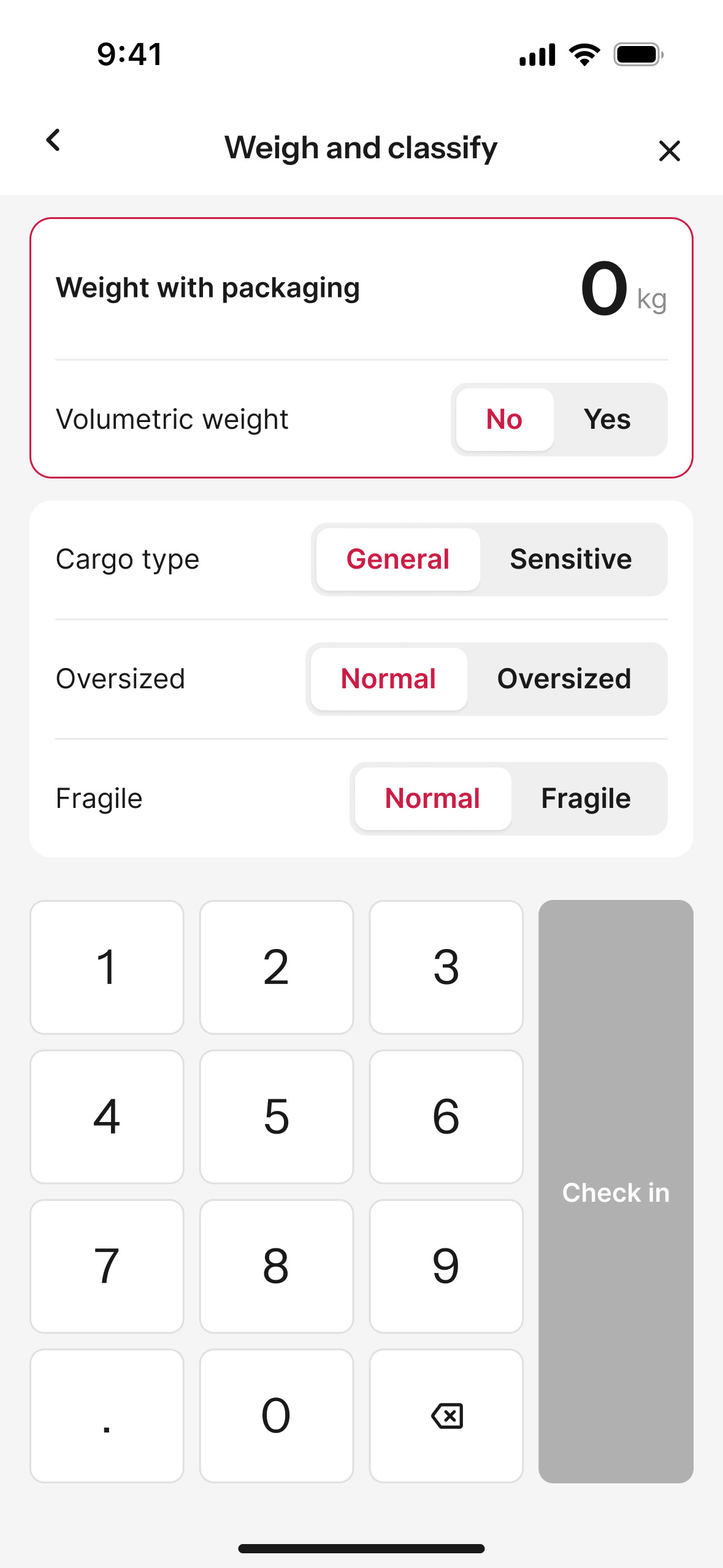
Warehouse
03. Weigh it, tag it
The part a camera can't do. Everything is a toggle except the weight, and the keypad and check-in button sit under the thumb already holding the phone.
-
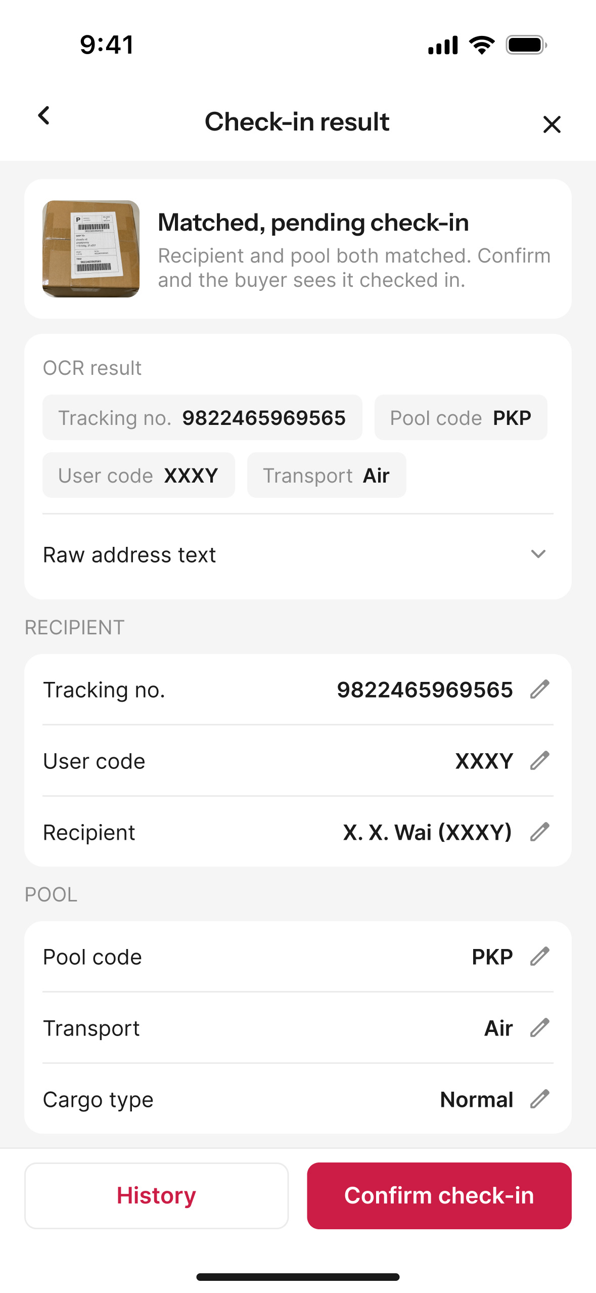
Warehouse
04. Match it to a person
A box is only somebody's once the code finds them. OCR returns every field in about four seconds — tracking number, pool, user, transport — each one editable, rather than one verdict to accept or reject.
-
Buyer
05. You don't have to check
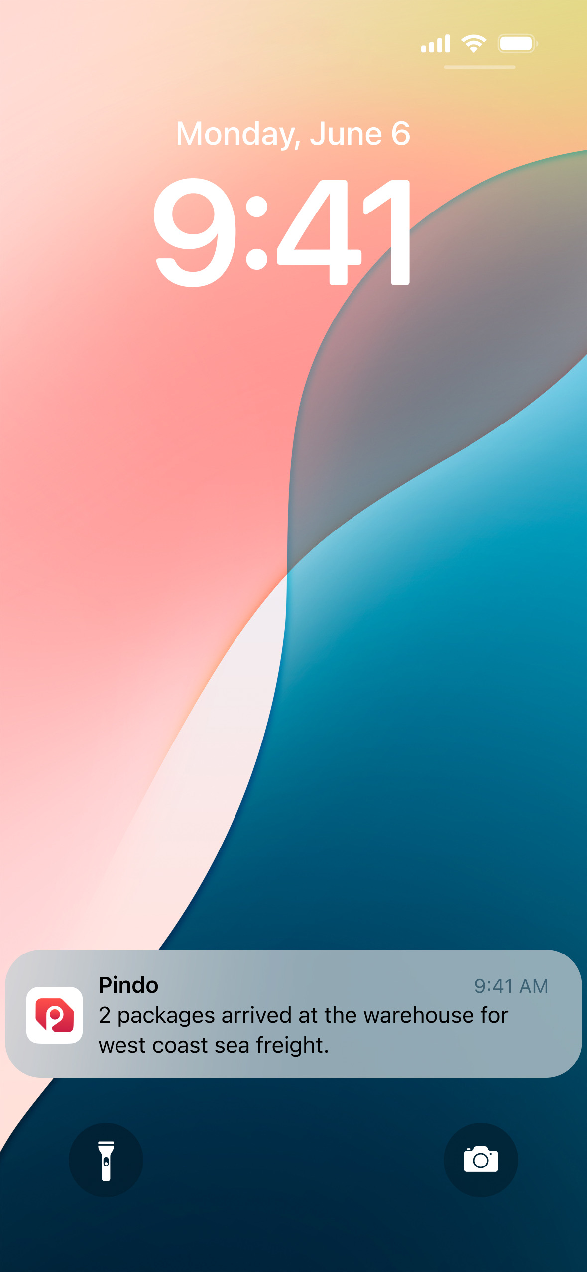
The moment the box is paired, the phone says so, batched by pool, so two parcels arrive as one line instead of two alerts. Nobody opens an app to find out that shipping is working.
-
Buyer
06. You see it arrive
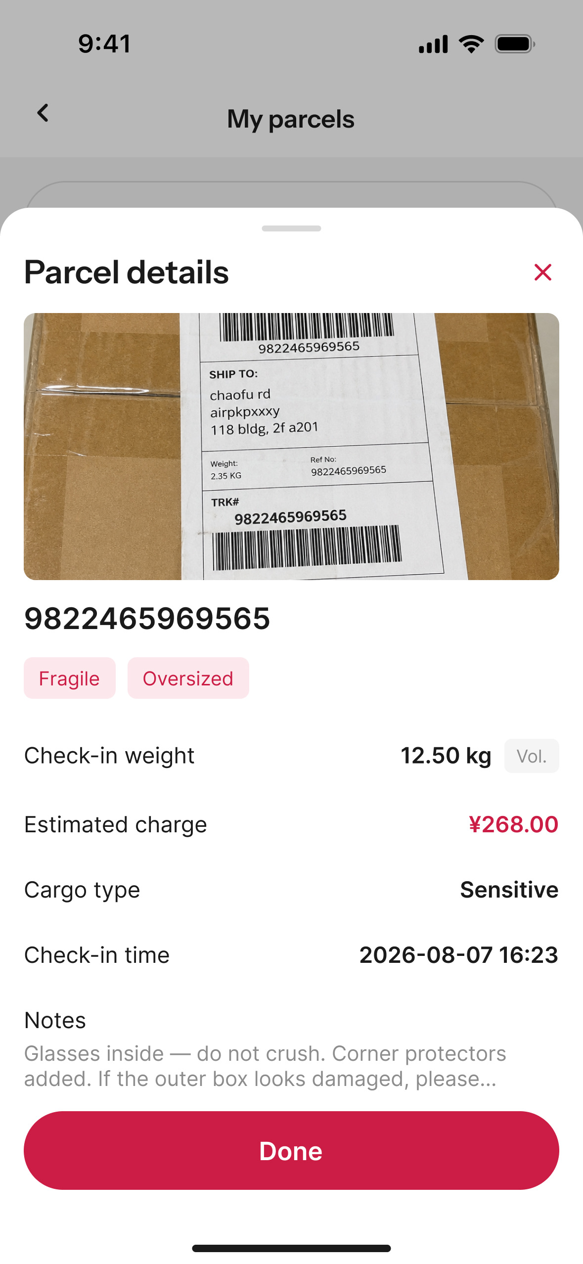
The box turns up in your app with the warehouse's own photo of it, the weight it was entered at, and what it will cost. Proof that the parcel named itself.
One photograph, no typing. The gain isn't warehouse throughput. It's that a box becomes somebody's the day it lands. The buyer's phone says so unprompted, one of three events that earn a push, alongside a pool shipping and money owed. The parcel sits in their app, photographed and weighed, while the container is still open. 60% of users had asked for exactly this: skip the typing, pull it in for me.
Seeing it that early is what makes it useful. A merchant answering
has mine arrived
now points at the screen the buyer already
has open. A buyer who can see their box can hold it for the next pool
instead of shipping a half-order. Either way the photograph and the
check-in weight are dated and stay on the parcel, so a disagreement
three weeks later is settled by a record, not by two memories.
All of it rests on one rule: a box is never held up for being understood. An unreadable label checks in anyway and waits to be claimed, with the tracking number as the whole credential. The one hard stop is sensitive goods in a general pool, because that channel physically cannot carry them. Everything else keeps moving, and so does the person working the queue. A screen that demands an answer before the next scan doesn't get one. It gets worked around.
Design system
设计系统A design system an agent can build from
We ship fast because the design system is machine-readable, not because anyone draws faster. An AI agent builds against it and takes every rule literally, which changed what the system had to be.
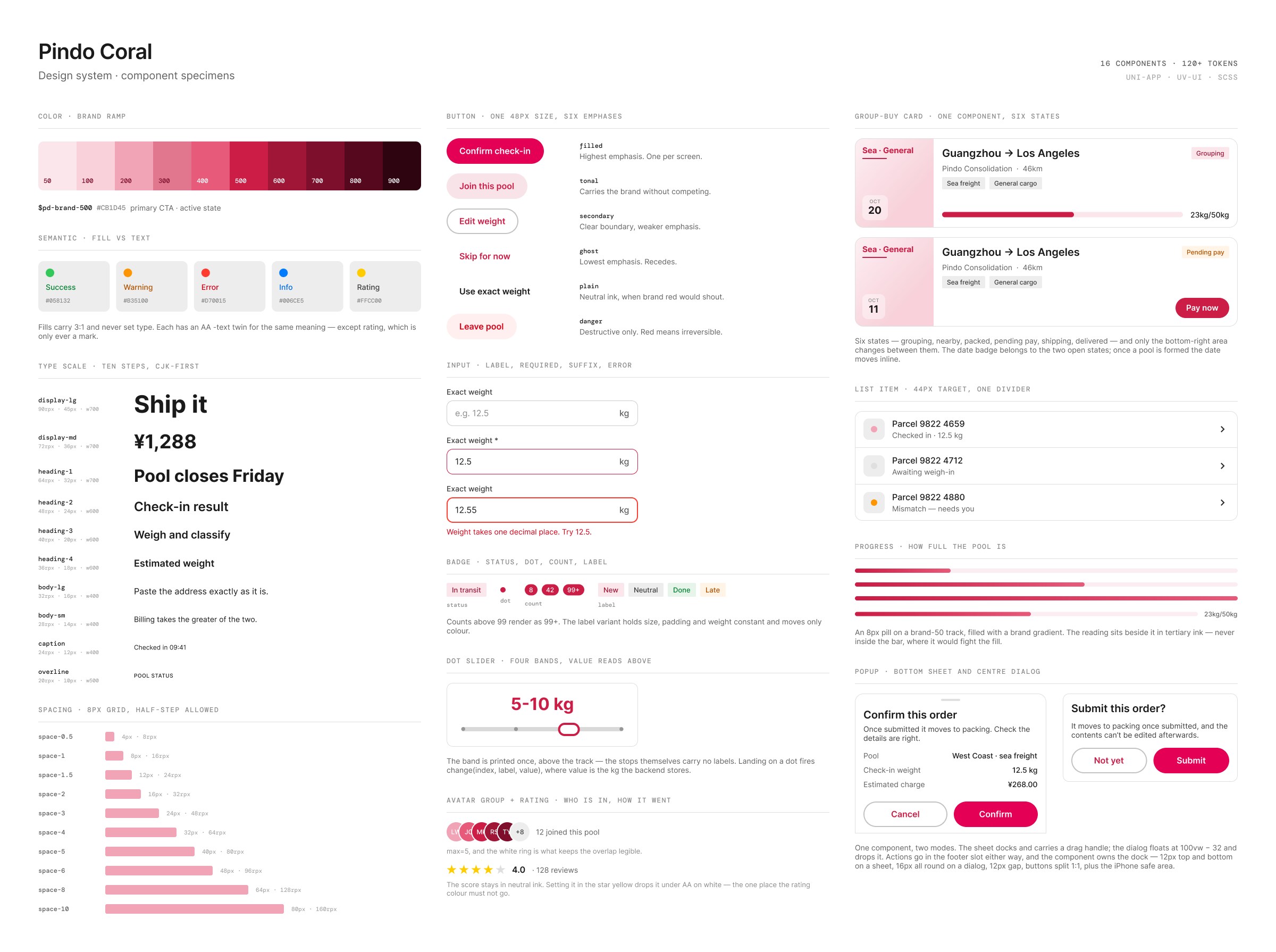
Pindo Coral is the result: sixteen components on 120+ design tokens, published as a searchable showcase anyone on the project can open. One rule sits underneath it. Every visual value is a token, and a raw number in a stylesheet is a defect, not a preference.
That was always good practice for people. For an agent it is the difference between building a screen and inventing one. It can guess a hex code, but it has to look up
$pd-text-secondary.
Where that authority stops took longer to settle. Inside the system the agent builds whatever a screen needs. It does not get to widen the public API. A new component, variant, prop, token or mixin has to be asked for first. Bug fixes and refactors don't, because neither changes what other screens can call.
The cost is asymmetric. Adding to the system takes an afternoon; removing something costs every screen already built on it. So the test is written down too: extend an existing component rather than add one, whenever the capability could plausibly appear on a second screen.
Removal still happens. In June the button went from three sizes to one. The two smaller sat under the 48px touch-target minimum, so they were deleted, and every screen using one had to migrate.
The content guide is one file of several. It sets the voice, then gets specific enough to be checkable: a character count per control, and a tiebreaker for when two good rules disagree.
The specificity is the trick. Taste that stays in my head can't be handed to anyone, an agent least of all. Every judgment I wanted the system to hold had to become checkable first, which made it clearer for the people on the project too.
- Voice
- A helpful neighbour. Warm and plain, never chatty.
- Button
- 12 characters
- Toast
- 20 characters
- Tiebreak
- When clarity and politeness pull apart, clarity wins.
Rules alone still leave every feature to be worked out from scratch, so the process is written down too: six phases, each owing the next a specific artifact before it can hand over.
Phase 5, the edge-case audit, is the one that earns its keep. Ten paths every time: back navigation, network failure, double taps, pasted junk, teardown mid-request, iOS against Android, every boundary a field will take. Then it stops. It reports what it found, graded by severity, and fixes none of it.
On the weight sheet it returned ten findings, four worth acting on. The one I still think about wasn't a crash. While the save was in flight both buttons disabled and the sheet couldn't be dismissed, trapping anyone on a weak connection. Disabling had been guarding against a race condition that turns out to be harmless — the save lands either way — so only the confirm button disables now. The state nobody draws is the one somebody meets first.
Whoever finishes a feature edits the playbook. Anything the six phases missed gets added, anything no longer true gets rewritten. Nothing is marked deprecated. It is deleted; version control already holds it.
The system made the first screen fast. What makes each one after it faster is the playbook. A correction I make by hand once is a note on a single screen. The second time it turns up it becomes a phase rule, and the agent stops making it. Ten audit paths then get spent on what's genuinely new instead of on last month's bug.
The same threshold keeps the playbook from bloating. A detail stays attached to the feature it came from until it happens twice. Two are waiting on that now, both from the weight sheet: carrying a value across when someone switches input modes, and a form whose buttons re-label once it already holds an answer.
None of this replaced the design work. What a screen is for, and which four of ten findings matter, are still done by hand. That is most of the job.
How it's landing
Pindo is early: a few hundred people and real boxes crossing the Pacific. The numbers below are theirs, from our first survey.
88.6% call the sign-up smooth, the easiest thing to get right and the easiest to lose. I care more about why they chose Pindo over a group chat, because they named what this case is about: being able to see what's happening. Their complaints were specific too. A fee breakdown that's hard to follow, a pickup chat that stutters on older phones. Both are next.
"The app puts the whole shipping process in one place, so I'm not chasing people back and forth."
Early user Product survey · n=35 · Preliminary
The photo intake is still behind a feature flag, so none of these
numbers include it. When it goes on, I'll be watching how many boxes
clear intake without anyone typing, and whether where's mine
stops turning up in the pickup groups.
What building it taught
The bottleneck moved. It used to be how long a screen took to build. Now it's how long it takes me to be sure a screen is right.
Neither problem in this case was hard to fix once I had seen it. The bar was an arithmetic change and the address code a string format. What took the time was noticing that a progress bar nobody had complained about was telling people nothing.
I built this site the same way I built Pindo: same tools, same habit of writing the rules down first. It seemed like the wrong thing to hide.